Why Your Startup Website Is Not Converting
Struggling with low conversions? Learn why your startup website is not working and how to fix clarity, structure, and messaging to drive real results.
7 min
Design
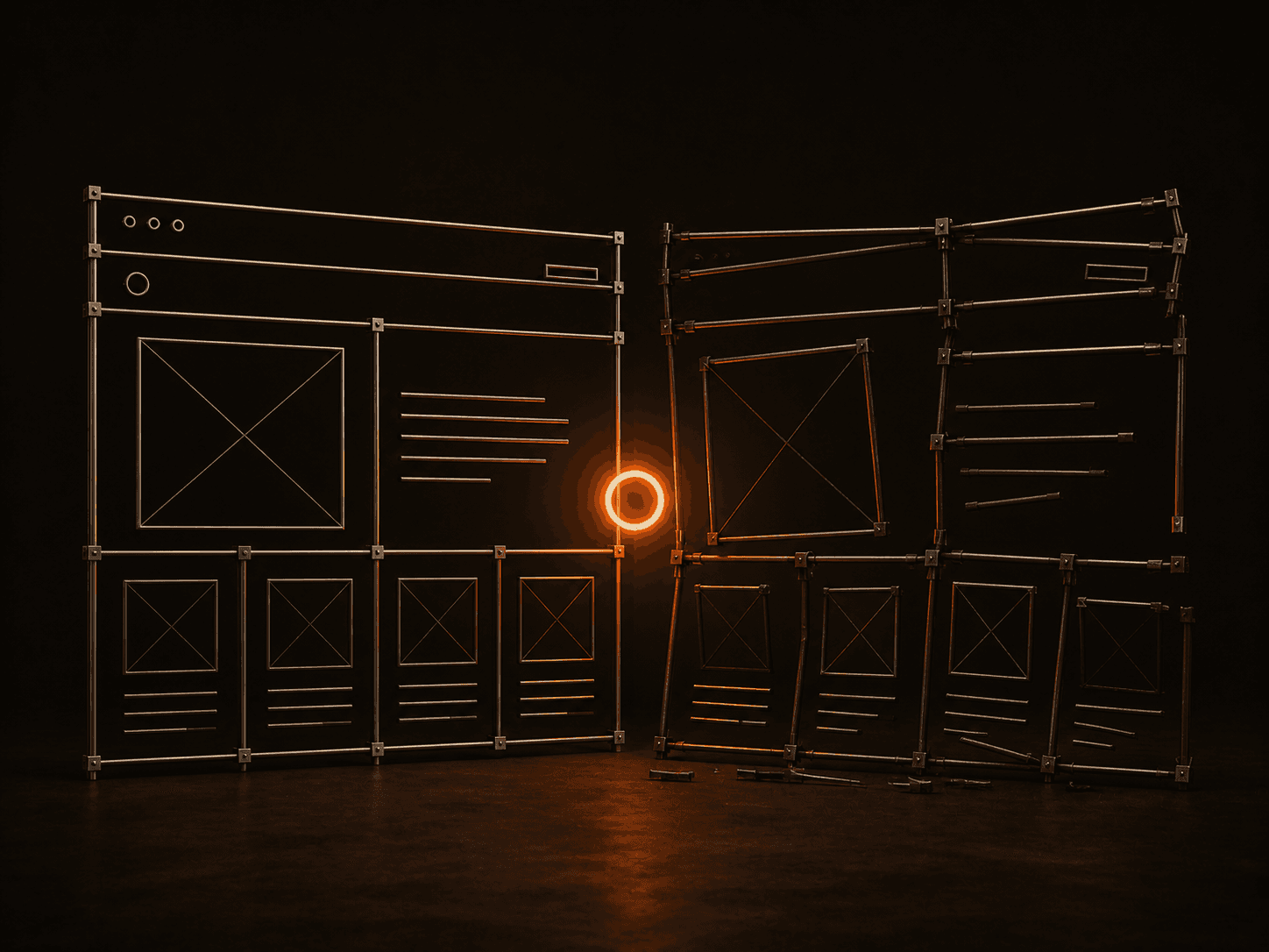

Your Website Is Not Converting Because It’s Not Understood
Most startup websites don’t fail because of bad design.
They fail because people don’t understand what they are looking at.
At 2WIK, this is the most common pattern we see. Founders assume something is broken in the design, when in reality, the issue starts much earlier.
A user lands on your website and, within a few seconds, tries to answer three things:
What is this
Is this for me
Why should I care
If those answers are not immediately clear, the interaction ends there.
This is not a design problem.
It’s a clarity problem.
The Illusion of “Good Design”
A common trap is assuming that visual quality will fix performance.
So teams invest in:
better UI
smoother animations
more polished layouts
The result often looks impressive. But performance doesn’t improve.
Because design without structure is decoration.
A high-performing website is not defined by how it looks, but by how quickly it creates understanding.
Where Most Startup Websites Break
The issue is rarely one big mistake. It’s usually a combination of small misalignments.
The first is weak positioning on the page itself. Instead of clearly stating what the product does, websites rely on vague statements that sound good but say nothing. This forces users to interpret, and most won’t.
The second is lack of structure. Sections exist, but they don’t follow a logical flow. Information feels scattered. Users are left figuring out the story on their own, which creates friction.
The third is inward messaging. Many websites talk about the company before addressing the user’s problem. This breaks momentum early.
And finally, there is no clear direction. Even if a user understands the product, the next step is not obvious or compelling enough to act on.
Individually, these feel minor. Together, they kill conversion.
What Actually Drives Conversion
Conversion is not a feature you add later.
It is the result of how clearly your website communicates.
From our experience at 2WIK, high-performing startup websites consistently follow a few core principles:
1. Immediate clarity
The homepage does not try to be clever. It is direct.
Users understand what the product does without effort.
2. Structured flow
Information is not just placed, it is sequenced.
A good flow typically answers:
what this is
who it is for
why it matters
how it works
why it can be trusted
This removes the need for users to think too much.
3. User-first messaging
The focus stays on the user’s problem and outcome, not the company’s story.
This builds relevance early.
4. Clear action
Every page leads to a specific next step.
There is no ambiguity in what the user should do next.
The Missing Layer: System Thinking
Most startup websites are built as pages.
High-performing ones are built as systems.
That means:
messaging is consistent across sections
design supports communication, not distracts from it
every element has a purpose tied to conversion
Without this, even a visually strong website feels disjointed.
And when things feel disjointed, users hesitate.
When users hesitate, they leave.
Why This Matters More Than You Think
In early-stage startups, your website is not just a marketing asset.
It is:
your first impression
your pitch
your conversion layer
If it fails to create understanding, you lose opportunities before any real interaction happens.
This is why improving conversion is not about redesigning everything.
It’s about fixing how your product is presented.
A Simple Way to Evaluate Your Website
If you want to assess your own website, don’t start with design.
Start with clarity.
Ask:
Can someone understand what we do in a few seconds
Does the page guide them step by step
Is the next action obvious and meaningful
If the answer to any of these is unclear, that’s where the problem lies.
Final Thought
Most startup websites don’t need more design.
They need better thinking.
Clearer messaging.
Stronger structure.
Intentional decisions.
At 2WIK, this is the core belief behind everything we build. Because conversion doesn’t come from how your website looks. It comes from how well it communicates.